Rocket Travel・B2B2C
Optimizing White-Label Payment Pages to Reduce Customer Friction and Boost Conversion
KEY RESULTS
4% conversion lift across partners (with 5.7% for Southwest Airlines), 3% lift to the points-boost feature, higher AOV, and fewer calls to CX.
Read on for how I navigated a tight timeline and facilitated a cross-functional decision-making process
Rocket’s payment page (left) and Booking.com’s (right)
THE CONTEXT
Rocket Travel builds hotel sites for leading loyalty programs.
“Hybrid” is a cobrand with Booking.com and one of Rocket’s key products.
Rocket designs and manages the payment page for special rewards offers and Booking.com owns the rest of the funnel.
PRODUCT FLOW
Rocket Travel – Booking.com Hybrid Cobrand Product
THE ROADMAP ITEM
Optimize the Hybrid payment page
Hybrid was deprioritized as Rocket grew. With a quarterly business review with partners was approaching, we aimed to deliver quick improvements.
THE APPROACH
With a vague roadmap item and a deadline looming, the project needed focus.
The existing page failed accessibility checks and wasn’t using Booking.com’s colors
I aligned with product and gauged their interest in larger UX changes.
We lacked time and dev resources, so we settled on a UI refresh with a short list of smaller, targeted changes to improve conversion and UX.
Mobile-specific optimizations would follow in a separate project later.
THE CHALLENGE
To navigate the timeline, I looked to the CX team and industry best practices.
The existing page failed to highlight room type, dates, breakfast and cancellation policies
I learned the existing page caused customers to call customer service.
Customers regularly booked the wrong room types and dates and called to ask about breakfast and cancellation policies when they couldn’t find them.
Collecting optimization ideas from across the industry
Industry best practices and past user tests were another great source of ideas.
I looked at the Baymard Institute and Google’s UX playbook for travel for inspiration and stored a long list of potential changes, sharing it with our cross-functional team.
DESIGN APPROACH
There were many stakeholders and competing interests to balance in deciding what to test.
Using ICE scoring to rank changes by effort and potential impact
Product & Leadership were focused on the KPIs, Partnerships was partner-focused, and CX was customer-focused.
To align us, I led a cross-functional workshop with the ICE model.


We prioritized low-effort, high-impact optimizations, picking ~20 changes to test.
Easy changes included things like hiding header links and unnecessary form fields, and visually reinforcing security via trust icons.
← Before & after


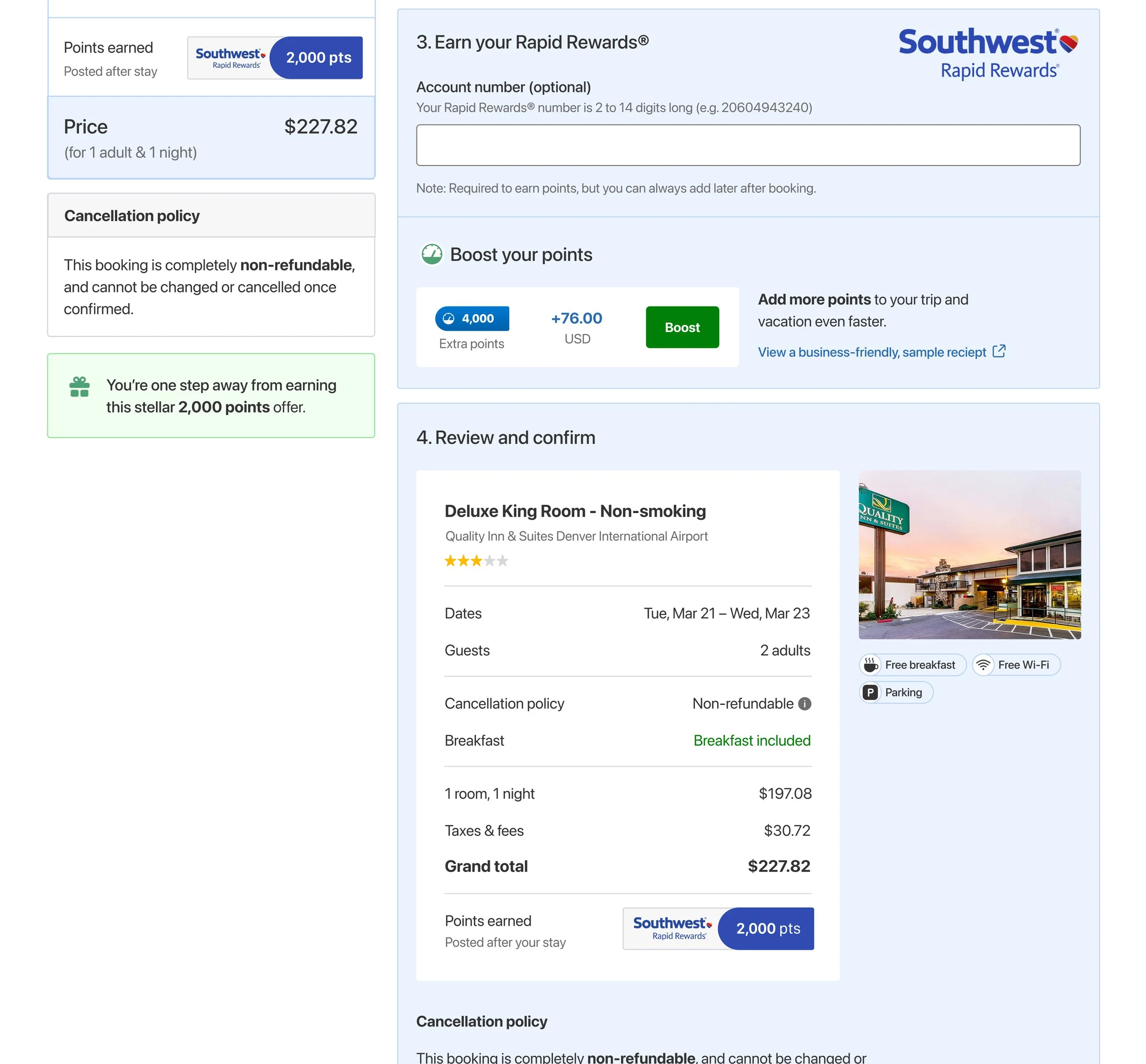
Highlighting the room type (e.g. King Room), dates, cancellation policies, and free breakfast became a focus.
The changes came from CX feedback, implemented alongside other changes.
← Before & after
GUIDING PRINCIPLES
While designing, I looked for more places to improve the UX—
Changes needed to be considered within the context of the larger product:
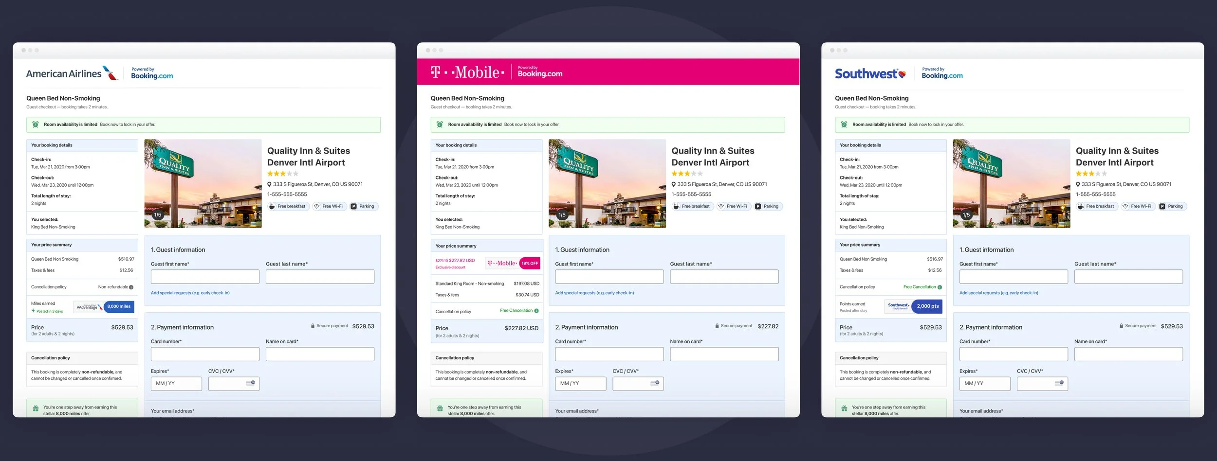
Matching Rocket’s payment page (left) with Booking.com’s (right)
1. Using UI and color consistency to build trust
Customers often open multiple payment page tabs to compare prices across hotels and different rooms.
I used the same layout, type, and colors as Booking.com to ensure a seamless experience between the different payment pages.
Highlighting the business-friendly sample receipt link
2. Considering business travelers
Customers often pay for extra rewards when reimbursing work travel.
I moved “View a sample receipt” near the CTA to show how the cost isn’t displayed in their receipt.
Reinforcing a secure checkout via subtle trust cues (lock icon) on the CTA
3. Instilling the confidence to book in the review step
Hotel bookings are a considered purchase for most customers, and they often scroll up to double-check important details before booking.
I redesigned the final review section to optimize for skimming and added room type, dates, cancellation policy, and breakfast.
Keeping customers informed while booking
4. Providing immediate feedback after confirming
It can take up to ~45 seconds after clicking to load the confirmation page.
I added interstitial status updates and guidance to keep customers from leaving or closing the page.
Redesigning the confirmation email (left) and confirmation page (right)
5. Providing details beyond the payment page
Customers often screenshot the confirmation page and emails to refer back to them later.
I added room type, dates, cancellation policy, and breakfast on these as well.
Documenting breakpoints, states, and edge cases for the Dev team in the Philippines
BUSINESS IMPACT
The redesign passed smoke testing and delivered a 4% conversion lift across all partners.
AOV increased as well, with a 3% lift on the points-boosting feature.
Conversion increased an average of 4% across American Airlines, Southwest, and T-Mobile Travel
CUSTOMER IMPACT
Post-launch, CX reported fewer calls from customers with the wrong room types or dates.
Calls asking about cancellation policies and breakfast slightly decreased.
Design A outperformed the rest and Booking.com’s was last
I click-tested designs to ensure customers could easily find booking details.
To find the cancellation policy — speed improved by 11 seconds (from 27 to 16 sec) and success rates improved by 17%.


Sadly, the confirmation page and email changes were deprioritized.
Product viewed these as less critical because they’re post-purchase, but I believe it would reduce the calls to CX even further.
← Before & after
BEFORE & AFTER
White-Label Payment Page


MISSED OPPORTUNITIES
In retrospect, I’d want to spend more time on hypotheses and aligning with Product on A/B test design.
Launching with ~20+ changes made it impossible to measure each individually. Breaking things up and testing incrementally, we’d spot performance drivers and could iterate on the rest.
Cheesing with the Rocket Design team, not at all posed
Overall though, I’m proud of how we balanced data-driven decision-making with speed.
I lifted conversion and AOV for the business, increased partners’ trust in Rocket, and improved the UX for customers.


