

Interior Define・B2B
Redesigning Navigation & IA to Boost In-store Traffic and Locations Pageviews
KEY RESULTS
A 9X increase in Location page visits and a significant boost to in-store appointments booked on the site.
Read on for how I approached a large-scale redesign and gained buy-in from across the org
Interior Define’s homepage in 2018
THE CONTEXT
Interior Define is a D2C startup specializing in custom sofas and other furniture.
I led the strategy, research, testing, and visual redesign of the information architecture (IA), top- and bottom-navigation, and menus.
THE CHALLENGE
The IA buried the most important revenue-driving pages.
The existing nav had overlapping categories and no mention of locations
The existing nav suffered from vague naming and overstuffed categories as the business grew.
In reviewing, I found it buried some of the most important pages driving conversion:
In-store locations
Book an appointment
Complimentary design advice

THE APPROACH
3 goals informed my strategy for the IA & nav redesign.
To kick things off, I set goals and presented goals and potential benefits of the redesign to stakeholders across the org.
Using in-person and online card sorting via Optimal Sort
I aimed to:
Reduce clicks to common destinations
Surface product categories (e.g. Sofas vs. Shop now), and
Highlight and prioritize the pages driving conversion
Pages grouped into categories by actual customers
EARLY INSIGHTS
In card sorting, customers confused sofas with sectionals and grouped products by room.
We used in-person and online card sort testing to inform a new, more intuitive IA. We used tree-testing to validate it.
Tree testing results for the existing nav
I used tree tested to try different IA versions, refine naming, and quantify performance.
The existing IA performed poorly, with a score of 3.6 (out of 10), on average.

KEY INSIGHT
Customers didn’t understand the term Guideshop—
The guideshop experience page linking to individual locations pages
Guideshops are the name for Interior Define’s in-store locations.
Most purchases were made in-store vs online, so driving traffic to the book an appointment link and individual locations pages became the focus.
Testing different wireframe versions
I used click-testing to optimize the naming and placement of the locations link.
Locations outperformed names like Visit us, Stores, Guideshops) and customers noticed it most when placed to the right of the logo.

THE OBSTACLES
Guideshops were core to the brand and held some sentimental value with the founder/CEO.
To gain buy-in, I included the CEO and teammates from across the org in the research and presented first-click results quantifying the performance of “Locations” vs “Guideshops” (below):
Customers found the Locations pages ~11.5 seconds faster, directness and task success increased
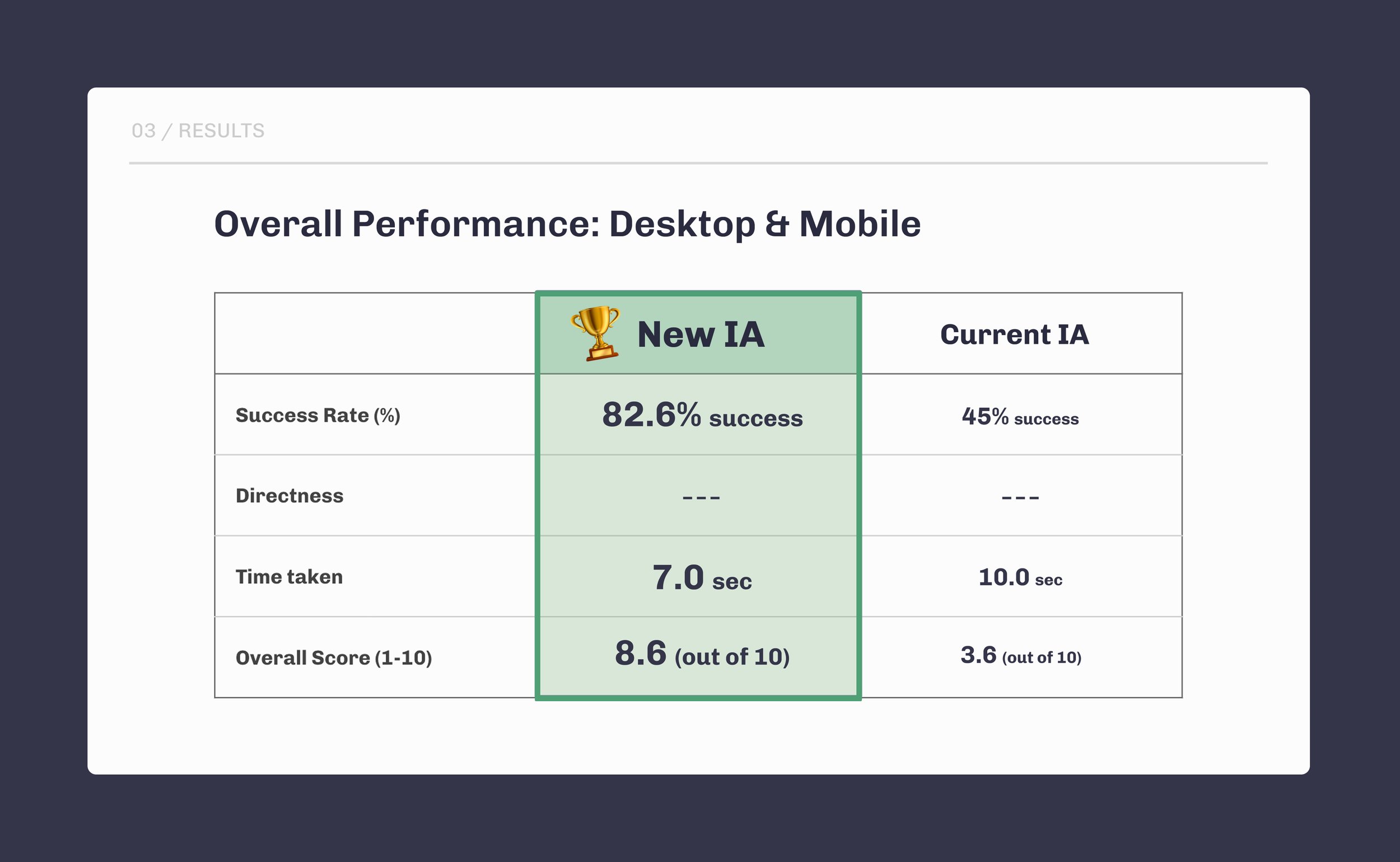
Performance improved by every measure and the score increased from 3.6 to 8.6 out of 10

FINAL DESIGNS
Improved product discovery and a more intuitive IA
I used Living, Dining, & Bedroom vs “Shop now” to surface the product collections on first glance
I added product images to help customers differentiate between categories (e.g. Sectionals vs Sofas)
I highlighted our live chat and complimentary design advice to guide customers and generate inbound leads
I highlighted locations, but didn’t entirely kill the term Guideshops— using it several places in the menu copy
On the footer, I highlighted individual locations to drive traffic and help with SEO
BUSINESS IMPACT
By prioritizing locations, I boosted traffic to individual locations pages by ~600-900%,

Inside Interior Define’s Chicago guideshop
Appointments booked via the site increased significantly.
This was a huge win, as customers prefered in-store purchases, and conversion rates during appointments reach ~60%.
The project earned us buy-in and laid the groundwork for our research and testing process going forward.


